Since the invention of smartphones, people have developed the habit of browsing the required information on their phones itself. This has led to the need for the websites to be adaptable to the phone screens which in turn led to the creation of responsive website design.
So, what is the meaning of Responsive Web Design? I will start this article by explaining it.
I will also mention Best Practices while creating a responsive website. Plus, a note about Website Load Speed and Performance because that does affect how a user responds to your website. 🙂
So,
What does responsive web design mean
Responsive website design is an approach to web design that allows a website to adjust its layout and elements to best fit the screen size and resolution of the device being used to view it.
This implies that, whether the reader uses a desktop computer, a tablet, or a smartphone, the layout and components on the page will change and rearrange themselves to best fit the screen size and resolution of the device.
Providing users with the best viewing experience possible, regardless of the device they are using, is the aim of responsive web design. As more and more people use the internet using a range of devices with various screen sizes and resolutions, providing a responsive website is becoming more and more crucial.
I have tried to provide detailed information about the various Responsive Design Best Practices in this article.
So, let’s read each of them.
Responsive Design: Best Practices
Use a fluid grid layout
In a fluid grid layout for web design, the width of the site is set to a percentage of the browser window rather than a fixed number of pixels. This makes the layout more adaptable and user-friendly by enabling it to respond to various screen sizes and resolutions.
Designers generally use CSS to specify the width of elements like columns and rows as a percentage of their parent container in order to create a fluid grid layout. As a result, the pieces can scale and automatically adjust to fit the size of the browser window.
Media queries can also be used by designers to adapt styles and layout guidelines for various screen sizes.
Here is an example of a simple fluid grid layout using HTML and CSS:
HTML:
Column 1

Column 2

Column 3
CSS:
.container {
width: 100%;
}

.row {
display: flex;
}

.col-25 {
flex: 1;
width: 25%;
}

.col-50 {
flex: 1;
width: 50%;
}

.col-25 {
flex: 1;
width: 25%;
}
This example uses a container class to set the width of the site to 100% of the browser window. Inside the container, there is a row class that uses flex to create a flexible layout. Inside the row, there are three columns, each with a class of “col-25”, “col-50” and “col-25”, respectively. These classes use flex and width to set the size of each column as 25%, 50%, and 25% of the parent container (row).
This is just a basic example, but in a real-world scenario, you would likely use a more robust grid system and include responsive CSS media queries to adjust the layout for different screen sizes and resolutions.
Also, frameworks like Bootstrap, Foundation, Bulma, and Tailwind CSS provide responsive grid system that helps you to create fluid grid layouts easily.
Understanding Target Devices and Screen Sizes for Responsive Web Design
The process of choosing which categories of devices and screen sizes the website or application will be optimized for is referred to as identifying the target devices and screen sizes for a website or application. This can include different screen sizes and resolutions for desktop computers, laptops, tablets, and smartphones.
For example, if a company wants to create a website that is optimized for smartphones and tablets, they will focus on screen sizes and resolutions commonly found on those devices. They would also consider the aspect ratio of the screen, which is the proportion of the width to the height of the screen.
For instance, if a website is targeted to smartphones with a 16:9 aspect ratio, they will design the website to fit in this aspect ratio and test it on different devices with same aspect ratio
The operating systems and browsers that the bulk of users will use to access the website or application should also be taken into account.
For instance, a website that gets most of its traffic from iOS users will need to be optimized for Safari, whereas a website that gets most of its traffic from Android users will need to be optimized for Chrome.
Companies can improve user experience by ensuring that their website or application looks and behaves as intended on the devices that their users are most likely to use by defining the target devices and screen sizes.
Use responsive CSS Media Queries
I am quite sure you already know what the media query is. But for the sake of explanation let me mention it here.
Media queries are a CSS technique that allows you to apply different styles to a webpage based on the characteristics of the device displaying the page. This can include things like the screen size, resolution, and even the device’s capabilities, such as whether or not it has a touchscreen.
An example of this would be changing the font size of a webpage when it is viewed on a small device, such as a smartphone. Here’s an example:
/* CSS styles for large screens */
body {
    font-size: 18px;
}

/* Media query for small screens */
@media screen and (max-width: 600px) {
    body {
        font-size: 16px;
    }
}
In this example, the body font-size is set to 18px for screens wider than 600px. However, if the screen is lower than 600px, the media query will apply the styles inside of it and set the font-size to 16px.
Depending on the size of the screen, you can also use media queries to hide or show components.
/* Media query for small screens */
@media screen and (max-width: 600px) {
    .menu {
        display: none;
    }
}
Thanks to this media query, the element with class “menu” will be hidden on devices less than 600px.
In addition to these uses, media queries can also be used to apply different styles based on the capabilities of the device (such as touch screens), apply different styles for different screen resolutions, and more.
Continuously Testing on a Variety of Devices for Responsive Website Design
To make sure that the design and functionality are consistent across all devices, you should test your website or web application on many devices, including various screen sizes, resolutions, and operating systems.
This is crucial since various gadgets may display websites differently due to their varied capabilities.
For instance, you might not notice if the font is too small to read on a mobile device, if you solely test your design on a desktop computer.
You can find and address any problems that might occur on various devices by testing on a range of them, such as a layout that does not function well on small screens or a button that is too small to be readily tapped on a touchscreen device.
To test the design across a range of devices, you can take the help of several tools. For example:
- Without having direct access to the devices, you can test a webpage on a variety of screen sizes and resolutions using emulator/simulation software.
- You may use the cloud-based tool, BrowserStack to test websites across a variety of platforms and browsers. It also provides access to a library of mobile devices, such as multiple iPhone, iPad, and Android device models.
- You may test the design on real gadgets like laptops, tablets, and smartphones.
This will help you get a clear understanding of how your design appears and works on various devices and will allow you to make any necessary adjustments.
Utilizing strategies such as mobile-first and progressive enhancement in web responsive design
These days it is suggested to use responsive UI design strategies like “mobile first” development and “progressive enhancement” to make sure that the design functions well across a variety of devices, which means you should employ specific design techniques to create a website or web application that can adjust to different devices, screen sizes, and resolutions so that it looks and functions properly on all of them.
Let’s understand what they mean.
Mobile First Development:
In this strategy, while developing a website or web application, the website is initially designed for the smallest screen, and then gradually, additional features and functionality are added for larger devices.
With this strategy, the website or web application is made to be as “resource- and screen-efficient” as possible for mobile devices, which have the smallest screens. The design is then gradually improved for larger screens.
Let’s take an example:
/* Mobile first styles */
body {
    font-size: 16px;
}

/* Media query for larger screens */
@media screen and (min-width: 600px) {
    body {
        font-size: 18px;
    }
}
The body font size in this example is set to 16 pixels, for screens that are narrower than 600 pixels. However, the media query will apply the styles inside of it, increasing the text size to 18px, if the screen is wider than 600px.
Progressive Enhancement:
Progressive enhancement is a design strategy that emphasizes a website’s or web application’s essential features before gradually adding more advanced features and functionality for users with more powerful devices. This strategy makes sure that every user, regardless of the capabilities of their device, may access the website or web application.
Example:
/* Core styles */
.menu {
    display: block;
}

/* Media query for advanced feature */
@media screen and (min-width: 600px) {
    .menu {
        display: flex;
    }
}
The class “menu” is configured in this example to be displayed across all devices as a block element. However, the media query will apply the styles inside of it if the screen is greater than 600px, which sets the display to flex.
You can make sure that your website or web application functions properly across a variety of devices, regardless of their screen size, resolution, or capabilities, by employing these responsive design strategies.
Utilizing Relative Units for Flexibility in Responsive Web Design
To ensure that items on a page alter their size according to the screen size, web designers employ relative units, such as percentage or ‘em’.
This contrasts with the use of fixed units, such as pixels, which can lead to items looking either too small or too huge on various screen sizes.
For instance, no matter the size of the screen, an element’s width will always be the same if you provide it in pixels. The width of the element will, however, be a percentage of the screen width if you use a percentage rather than a fixed value.
Here is an example of how to set an element’s width using percentages:
<div style="width: 50%;">Half of the screen will be occupied by this component.</div>
Similarly, ‘em’ is a comparable relative unit of measurement that is based on the parent element’s font size. Therefore, using ‘em’ to specify an element’s width and setting the parent element’s font size to 16px would be comparable to using pixels.
<div style="font-size: 16px;">
  <div style="width: 2em;">This element will be 32px wide (2 x 16px)</div>
</div>
Relative units, like percentage and ‘em’, cause components on a page to resize according to the size of the screen, improving responsiveness and device compatibility.
Responsive Design Breakpoints: Utilizing Specific Screen Sizes and Resolution Thresholds
Breakpoints are defined as particular screen sizes or resolution thresholds at which the layout of a website alters to better fit the device or screen size. They help to guarantee that a website works well and looks well across a range of screens and devices.
For instance, a website that appears fantastic on a large desktop screen may not appear as fantastic on a small mobile device. In order to ensure that the site looks well on all devices, breakpoints allow the layout of the site to be altered at particular screen sizes.
Here’s an example of how to use a breakpoint in CSS:
@media only screen and (min-width: 768px) {
  /* CSS styles that will be applied when the screen width is at least 768px */
}
In the given example, the CSS styles within the media query will only be applied when the screen width is 768px or more. In other words, the layout will change when the screen width is equal to or greater than 768px.
The layout can be changed at various screen sizes by setting numerous breakpoints based on various screen sizes. This can help to guarantee that the website looks well on all devices, from big desktop screens to tiny mobile devices.
In addition to screen size, resolution can also be used to establish breakpoints. When the device’s resolution changes, as it does with HiDPI screens or Retina displays, the layout can alter as a result.
Breakpoints are frequently established at typical screen sizes, such as 320px (small mobile devices), 768px (tablets), and 1024px (computer monitors) (small laptops and some desktops). However, depending on how the website is built and the devices it is intended for, other breakpoints may be used.
In addition to the screen size, breakpoints should take the device’s aspect ratio, orientation, and resolution into account. A website should be adapted for both portrait and landscape tablet orientations because, for instance, a tablet in landscape mode will have a different screen size.
Setting breakpoints must also take into account the user’s experience. For instance, it might be necessary to enlarge the font and the buttons on a small mobile device to make the site usable on the screen. On a large desktop screen, it could be possible to display more content simultaneously.
Breakpoints can be used to alter JavaScript’s behavior or to load alternate graphics and other resources, in addition to utilizing media queries to alter a website’s layout at particular screen sizes. Images, for instance, can be loaded in various resolutions depending on the device’s screen size or resolution.
In conclusion, breakpoints are crucial to the creation of responsive layout. They are employed to make sure that a website appears beautiful and is simple to use across a range of devices and screen sizes by altering the site’s layout at particular screen sizes or resolution thresholds. They should be set based on the design of the website, the devices that are being targeted, and the user experience.
Responsive and Adaptive Design: Enhancing User Experience implementing Touch-Friendly Elements and Navigation
Designing the website in a way that makes it simple for consumers to interact with it using their fingers on a touchscreen device is referred to as using touch-friendly components and navigation. This involves making the website’s buttons larger and the scrolling user-friendly so that users may tap or swipe to use the website with ease.
For instance, employing larger buttons when developing a mobile website can make it simpler for consumers to tap them precisely with their fingers. Similar to this, using finger-friendly scrolling techniques like smooth scrolling and avoiding components in fixed positions can make it simpler for users to scroll through the page’s content.
Take for instance, a mobile app for a news website. It may employ big, simple-to-tap navigation buttons and finger-friendly scrolling to let users quickly swipe through stories. The app may also employ movements like pinch-to-zoom to make it simple for users to see text, even on devices with lesser resolutions.
When designing a website for touch-based devices, it’s crucial to take the spacing and arrangement of the pieces into account. For example, elements should be spaced out enough so that users don’t accidentally tap the wrong button or link. Additionally, elements should be positioned so that the user’s thumb, which is the most frequently used finger for tapping on touch-based devices, can easily access them.
In short, touch-friendly navigation and elements refer to building a website or mobile app such that people may easily interact with it using their fingers on a touchscreen device. This involves employing bigger buttons, scrolling that is easy on the fingers, a layout that is spaced apart, and appropriate gestures.
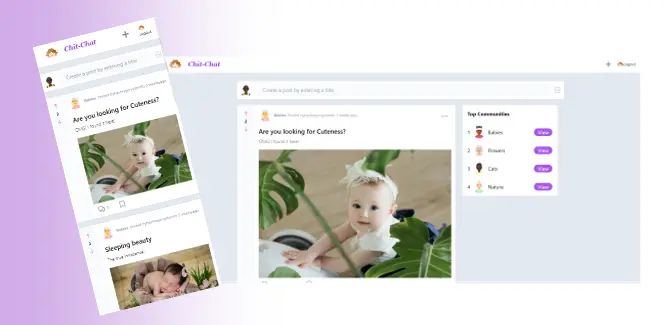
Use responsive images
Responsive images are images that automatically adjust to the size of the screen on which they are being viewed. This is crucial because different devices have various screen sizes and resolutions. By using responsive photos, you can be confident that all of your images will load quickly and look beautiful.
Think about an image that is 1000 pixels wide and 700 pixels tall, for instance. This image might appear fantastic on a huge desktop computer monitor, but it might be too big and take too long to load on a small mobile phone. When viewed on a mobile device, a responsive image will automatically reduce its resolution to a lower size so that it will load quickly and display properly.
To create responsive images, you can use the srcset and sizes attributes on the img tag in HTML. For example:
<img srcset="image-small.jpg 500w, image-medium.jpg 1000w, image-large.jpg 2000w"
     sizes="(max-width: 500px) 500px, (max-width: 1000px) 1000px, 2000px"
     src="image-medium.jpg" alt="My responsive image">
The sizes element in this example indicates the size of the image that should be used depending on the screen size, while the srcset attribute contains various copies of the image at various resolutions. By doing this, it is ensured that the ideal image will be loaded into each device.
There are several methods for making images responsive besides the srcset and sizes properties, including using CSS media queries or a framework like Bootstrap.
Using the max-width property to set an image’s maximum width is a frequent CSS trick. For example:
img {
  max-width: 100%;
}
Regardless of the size of the screen, this will ensure that the image never extends beyond the width of its contained element.
Another approach is to use a JavaScript library or framework such as Picturefill to load different versions of an image depending on the screen size.
<picture>
  <source srcset="image-small.jpg" media="(max-width: 500px)">
  <source srcset="image-medium.jpg" media="(max-width: 1000px)">
  <source srcset="image-large.jpg">
  <img src="image-medium.jpg" alt="My responsive image">
</picture>
In this example, several versions of an image are specified using the picture and source elements, and the media property specifies when to utilize each version.
A resourceful option if you have a lot of photographs to handle is to use services like Cloudinary, which automatically creates and provides images at various resolutions depending on the client device’s screen size and connection speed.
Point to note here is that responsive images are not only about screen size but also about the user’s connection speed. It is important to have a balance between quality and file size.
Ensuring Accessibility and Usability for Users with Disabilities Across All Devices with Responsive Web Design
Considerations for accessibility and usability are crucial components of responsive design since they guarantee that users with disabilities can access the website and that the layout is clear and simple to use across all devices. This could, for instance, include:
- To identify headings, lists, links, and other elements on the page use proper HTML syntax and semantic structure. This makes the page more accessible to users with visual impairments by assisting technology like screen readers in understanding the text and layout of the page.
- Including alternative text with photographs and other non-text items to help people with vision problems understand the page’s content.
- Making it simple for users to obtain the information they require by employing a consistent navigation structure throughout the website and using labels for links and buttons that are obvious and understandable.
- Ensuring that all navigational options are accessible via keyboard so that users who are unable to use a mouse or touch screen can still access all areas of the website.
- Making the website easier to read for users with visual impairments by using high-contrast color schemes and larger text sizes.
- Using ARIA (Accessible Rich Internet Applications) attributes to give assistive technology more information
- Making sure that the site is usable with just a keyboard, as some users may not be able to use a mouse.
- Ensuring that text on the website can be zoomed in and out and has a sufficient font size.
An example of this would be a website that sells goods and offers the option of filtering results for product searches; the filter options should be keyboard navigable, accessible through screen readers, and have labels that are easy for users with visual impairments to grasp.
Utilizing progressive web app technologies for improved user experience through responsive web design
A web application can offer a mobile app-like experience by utilizing Progressive Web App (PWA) technologies like service workers and web manifest. These technologies enable web applications to function offline, receive push notifications, and provide a user experience similar to that of native apps.
What is Service Worker
A script that functions independently from the web page in the background of a web application is known as a service worker. The web application can operate offline thanks to service workers’ ability to cache resources. The web application can get notifications even when the user is not actively using it since it can handle push notifications and background synchronization.
Here’s an example of how to register a service worker in JavaScript:
if ('serviceWorker' in navigator) {
  window.addEventListener('load', function() {
    navigator.serviceWorker.register('/sw.js').then(function(registration) {
      // Registration was successful
      console.log('ServiceWorker registration successful: ', registration.scope);
    }, function(err) {
      // registration failed 🙁
      console.log('ServiceWorker registration failed: ', err);
    });
  });
}
What is a Web Manifest
A web manifest is a simple JSON file that provides metadata about the web application, such as the name, icons, and start URL. This file is used to provide a native-like experience, such as allowing the web application to be added to the home screen of a mobile device.
Here’s an example of a web manifest file
{
  "name": "My Progressive Web App",
  "icons": [{
    "src": "icon.png",
    "sizes": "192x192",
    "type": "image/png"
  }],
  "start_url": "index.html",
  "display": "standalone"
}
In this example, the web manifest file provides the name of the app “My Progressive Web App”, icons for the app, the start URL, and the display mode.
By using PWA technologies like service workers and web manifest, web applications can provide offline functionality, push notifications, and a mobile app-like experience. This makes web applications more reliable, fast, and engaging for users.
How to make website responsive using CSS and JavaScript
Combining JavaScript and CSS can result in a responsive and fully working website design. The style and functionality of the website can be modified using JavaScript to take into account the size and capabilities of the device accessing it.
To make a website more readable and useful on various devices, CSS may be used to adjust the design of page elements like font size and spacing.
Let’s imagine, for illustration, that your website has a navigation menu. The menu may appear horizontally at the top of the page on a large desktop screen, but it may look better vertically in the form of a “hamburger” icon on a small mobile screen.
If the device viewing the website has a screen that is smaller than a certain size, JavaScript could be used to identify that size and show the “hamburger” icon in place of the horizontal menu. The menu and “hamburger” icon’s styling might be altered with CSS so that they appear appealing and are simple to use on small screens.
The example demonstrates how to use the @media query in CSS to determine the screen size and apply various styles accordingly.
/* CSS for large screens */
    @media only screen and (min-width: 980px) {
        /* Here are Styles for small screen */
    }

    /* CSS for medium screens */
    @media only screen and (min-width: 757px) and (max-width: 979px) {
        /* Here are Styles for medium screen */
    }

    /* CSS for small screens */
    @media only screen and (max-width: 756px) {
        /* Here are styles for large screen */
    }
JavaScript can also be used to show/hide elements based on screen size, and also add/remove classes to change the layout.
let mq = window.matchMedia("(max-width: 600px)");
    if (mq.matches) {
        // less than 600 pixel wide window
    } else {
        // more than 600 pixel wide window
    }
This is but one illustration of how JavaScript and CSS may be combined to produce a responsive and fully working website design. Numerous additional methods and tactics are also available.
Making a Website Responsive using Bootstrap: Utilizing a Responsive Framework
With the aid of responsive frameworks, such as Bootstrap or Foundation, it becomes simpler for developers to create websites that look good and work well on a variety of different devices, including desktop computers, laptops, tablets, and smartphones.
These frameworks are pre-written collections of CSS and JavaScript code. These come with a variety of pre-designed components that can be readily modified to match the appearance and feel of a website, including navigation menus, forms, buttons, and more.
With a flexible grid structure, pre-made UI components, and pre-written JavaScript plugins, Bootstrap makes it simple for developers to create responsive UI designs.
Optimize website for load speed and performance.
Making sure the website loads quickly and operates without a hitch across all devices is a key component of website performance optimization. Images and other large files can be compressed, CSS and JavaScript code can be compressed, and a Content Delivery Network (CDN) can be used to distribute the website’s files among various servers.
For instance, utilizing a tool like Google Page Speed Insights to pinpoint portions of a website that take too long to load, followed by compressing images and minifying code, can help to increase a website’s performance and load time.
Conclusion
I would like to conclude by mentioning that responsive design is the need of modern web development. A website must be able to change its appearance and functionality to offer the greatest possible user experience for each unique viewer given the growing variety of devices and screen sizes.
Websites can give all visitors, regardless of the device they are using, a consistent and pleasurable user experience by utilizing responsive design. For responsive designs to be both user-friendly and aesthetically pleasing, web developers and designers need to stay up to date on the newest design trends and technology.