I still remember the moment I first explored css grid. I had just finished writing my earlier guide on fixing alignment issues with Flexbox, and I was finally feeling confident using Flexbox for clean, one direction layouts. Flexbox had already made my life easier for things like navigation bars, cards, and everyday alignment tasks. Flexbox felt reliable and familiar.
But when I started working on layouts that needed both rows and columns together, I realised there was a whole new level of control waiting for me. That was the day I truly understood why css grid exists. It was not about replacing Flexbox, but about expanding what was possible. With css grid, arranging entire sections of a page suddenly felt structured, visual, and beautifully predictable.
In this guide, I will take you through CSS Grid step by step, starting from the basics and moving into real examples you can use in real projects. By the end, you will feel confident creating everything from simple product grids to full page layouts while keeping your code clean, organised, and easy to maintain.
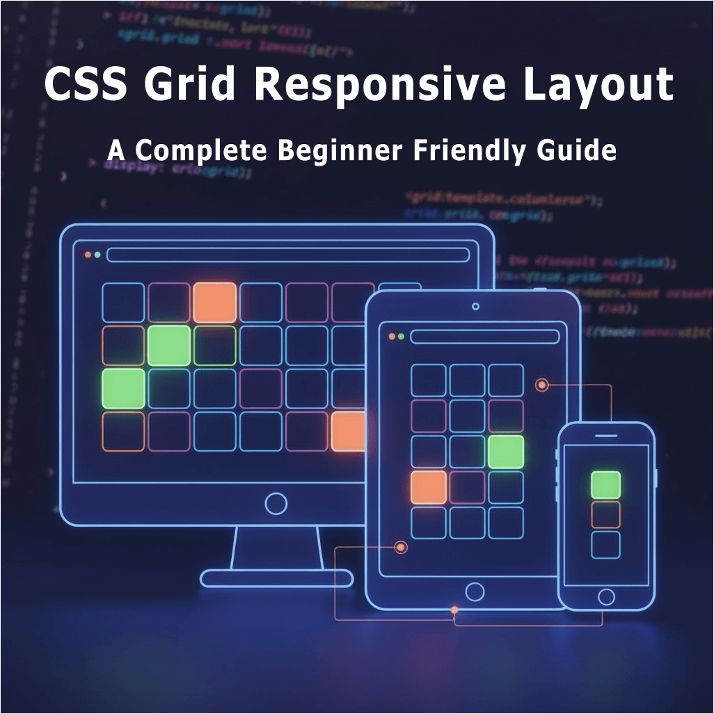
What Is CSS Grid and Why You Should Use It
Imagine a chessboard. You have rows, columns, and full control over where every piece goes. That’s exactly how CSS Grid works. Unlike Flexbox, which works in a single direction (row or column), CSS Grid allows you to design both rows and columns simultaneously.
CSS Grid is perfect for:
- Landing pages with multiple sections
- Product or feature grids
- Dashboards with cards and panels
- Any layout where you need two-dimensional control
Think of Flexbox as a Swiss Army knife for alignment along one axis. CSS Grid is the blueprint for the whole page layout. And the best part? You can combine both. Many professional developers, myself included, use Flexbox inside grid items for fine-tuned alignment.
For authoritative references, check out MDN CSS Grid Guide and CSS-Tricks Complete Guide to Grid. These are my go-to resources whenever I need deeper clarification.
CSS Grid Basics: The Building Blocks
Before we dive into real projects, let’s understand the essential pieces of CSS Grid:
1. Grid Container
The grid container is the parent element. You turn a normal container into a grid with:
.container {
  display: grid;
}
2. Grid Items
All direct children of the grid container become grid items. You can place, align, and size them using grid properties.
3. Grid Template Columns
Define how many columns you want and their width:
.container {
  grid-template-columns: repeat(3, 1fr);
}
4. Gap
Instead of adding margins manually between elements, CSS Grid allows gap for rows and columns:
.container {
  gap: 20px;
}
5. Fraction Units (fr)
fr units divide available space proportionally. 1fr 2fr means the first column takes one part, and the second column takes two parts.
6. Auto-Fit & Auto-Fill
For responsive grids, auto-fit and auto-fill allow columns to adjust automatically based on available space. We will use this later in practical examples.
Step 1: Building a Simple CSS Grid Layout
Let’s start small with a simple 3×2 grid:
<div class="grid">
  <div class="item">1</div>
  <div class="item">2</div>
  <div class="item">3</div>
  <div class="item">4</div>
  <div class="item">5</div>
  <div class="item">6</div>
</div>
.grid {
  display: grid;
  grid-template-columns: repeat(3, 1fr);
  gap: 20px;
}

.item {
  background: #4CAF50;
  color: white;
  padding: 30px;
  text-align: center;
  font-size: 18px;
  border-radius: 8px;
}
This creates a responsive three-column layout. Even if the content changes, the items stay aligned, a huge advantage over older float-based layouts.
Step 2: Making the Grid Fully Responsive
No modern layout is complete without responsiveness. Here’s how I make a grid adapt to different screens:
@media (max-width: 1024px) {
  .grid {
    grid-template-columns: repeat(2, 1fr);
  }
}

@media (max-width: 600px) {
  .grid {
    grid-template-columns: 1fr;
  }
}
Now, your three-column layout collapses to two columns on tablets and a single column on mobile devices.
One of the best things about CSS Grid is how naturally it handles responsive layouts. You can define columns once and let the browser intelligently rearrange them without extra markup
Step 3: Real-World Example – Product Card Grid
Let’s build a product grid like the ones you see on e-commerce sites.
<div class="products">
  <div class="card">
    <img src="product1.jpg" alt="Product One">
    <h3>Product One</h3>
    <p>$29.99</p>
  </div>
  <div class="card">
    <img src="product2.jpg" alt="Product Two">
    <h3>Product Two</h3>
    <p>$39.99</p>
  </div>
  <div class="card">
    <img src="product3.jpg" alt="Product Three">
    <h3>Product Three</h3>
    <p>$49.99</p>
  </div>
</div>
.products {
  display: grid;
  grid-template-columns: repeat(auto-fit, minmax(250px, 1fr));
  gap: 30px;
  padding: 20px;
}

.card {
  border: 1px solid #ddd;
  border-radius: 10px;
  overflow: hidden;
  text-align: center;
  transition: transform 0.3s;
}

.card:hover {
  transform: scale(1.05);
}

.card img {
  width: 100%;
  height: auto;
}
Notice auto-fit and minmax. These are life-savers for responsive design. Each card adjusts to available space without breaking the layout.
Step 4: Nesting Grids for Complex Layouts
Sometimes one grid isn’t enough. Think dashboards, multi-section layouts, or landing pages. CSS Grid allows nested grids:
<div class="dashboard">
  <div class="sidebar">Sidebar</div>
  <div class="main">
    <div class="sub-grid">
      <div>Item 1</div>
      <div>Item 2</div>
      <div>Item 3</div>
      <div>Item 4</div>
    </div>
  </div>
</div>
.dashboard {
  display: grid;
  grid-template-columns: 200px 1fr;
  gap: 20px;
}

.sub-grid {
  display: grid;
  grid-template-columns: repeat(2, 1fr);
  gap: 10px;
}
Nested grids allow designers to create advanced layouts while keeping the code clean. I use this trick on almost every landing page I build now.
Step 5: Aligning Items in CSS Grid
Alignment is simple in CSS Grid:
.grid {
  display: grid;
  grid-template-columns: repeat(3, 1fr);
  gap: 20px;
  justify-items: center;
  align-items: center;
}
This ensures all items are centered horizontally and vertically. No more hacky margins or extra wrappers like before I discovered CSS Grid.
Step 6: Building Hero Sections with CSS Grid
A hero section is often the first impression of a website. CSS Grid makes it effortless:
<div class="hero">
  <div class="text">
    <h1>Welcome to CSS Grid</h1>
    <p>Learn the easy way</p>
    <button>Get Started</button>
  </div>
  <div class="image">
    <img src="hero.jpg" alt="Hero Image">
  </div>
</div>
.hero {
  display: grid;
  grid-template-columns: 1fr 1fr;
  align-items: center;
  gap: 40px;
  padding: 50px;
}

@media (max-width: 768px) {
  .hero {
    grid-template-columns: 1fr;
    text-align: center;
  }
}
Even the hero section becomes responsive automatically. It stacks beautifully on smaller screens.
Mastery, Tips, and Comparison
Now that you’ve mastered the foundational layouts and techniques, CSS Grid becomes far more powerful once you move beyond the basics. In this section, we’ll explore the most common mistakes beginners make, practical tips to level up your layouts, a clear comparison between CSS Grid and Flexbox, and a final advanced project example to synthesize all the skills. These insights will help you build cleaner, faster, and more intuitive responsive designs.
Common Beginner Mistakes
When I first started with CSS Grid, I made these mistakes:
- Forgetting display: grid on the parent container
- Using fixed pixel widths instead of fr units
- Over complicating nested grids
- Ignoring mobile responsiveness
- Not combining Flexbox inside grid items for fine alignment
Avoiding these saved me hours of frustration.
Advanced CSS Grid Tips
- Use minmax and auto-fit – for responsive columns
- Consistent gap – avoids messy spacing
- Combine Flexbox inside grid items – for perfect alignment
- Test across devices – grids may look perfect on desktop but need tweaks on mobile
- Semantic HTML – improves accessibility and SEO
Flexbox vs CSS Grid
If you read my Flexbox guide, you know Flexbox is ideal for single-axis layouts. CSS Grid handles two-dimensional layouts perfectly. Use both together: CSS Grid for structure, Flexbox for fine alignment inside items.
Real Project Example – Feature Grid for Landing Page
Imagine a landing page section with three feature cards. I built it like this:
<section class="features">
  <div class="feature-card">
    <div class="icon">🚀</div>
    <h3>Fast Performance</h3>
    <p>Loads under 1 second</p>
  </div>
  <div class="feature-card">
    <div class="icon">🔒</div>
    <h3>Secure Design</h3>
    <p>Encrypted & safe</p>
  </div>
  <div class="feature-card">
    <div class="icon">🌍</div>
    <h3>Global Access</h3>
    <p>Works anywhere</p>
  </div>
</section>
.features {
  display: grid;
  grid-template-columns: repeat(auto-fit, minmax(250px, 1fr));
  gap: 24px;
  padding: 40px;
}

.feature-card {
  display: flex;
  flex-direction: column;
  justify-content: space-between;
  padding: 30px;
  border: 1px solid #eee;
  border-radius: 8px;
  text-align: center;
}
Notice the combination of CSS Grid for layout and Flexbox inside cards for spacing. This ensures icons, text, and links stay aligned even when content length varies.
Conclusion
CSS Grid is a modern and powerful layout system that truly makes web design easier for everyone.
I still remember the days when I spent hours adjusting margins and floats just to make elements align. After switching to CSS Grid, those struggles disappeared. Creating complex layouts suddenly felt simple, responsive design became more intuitive, and my code looked cleaner and easier to maintain.
When you understand CSS Grid and combine it with Flexbox where needed, you unlock the ability to build responsive, organised, and visually polished layouts in very little time. You can start with something small like a product section or a basic hero layout and slowly move into advanced ideas such as nested grids, auto fit, and minmax.
If you want to grow as a modern web developer, learning CSS Grid is essential.
Your layouts will become easier to manage, your code will stay cleaner, and building responsive designs will start to feel natural, intuitive, and enjoyable.